Whistler Bungee Rebrand
Client:
Whistler Bungee
Type:
Branding & Pamphlet Design
Skill Set:
Custom Logo & Pamphlet Layout
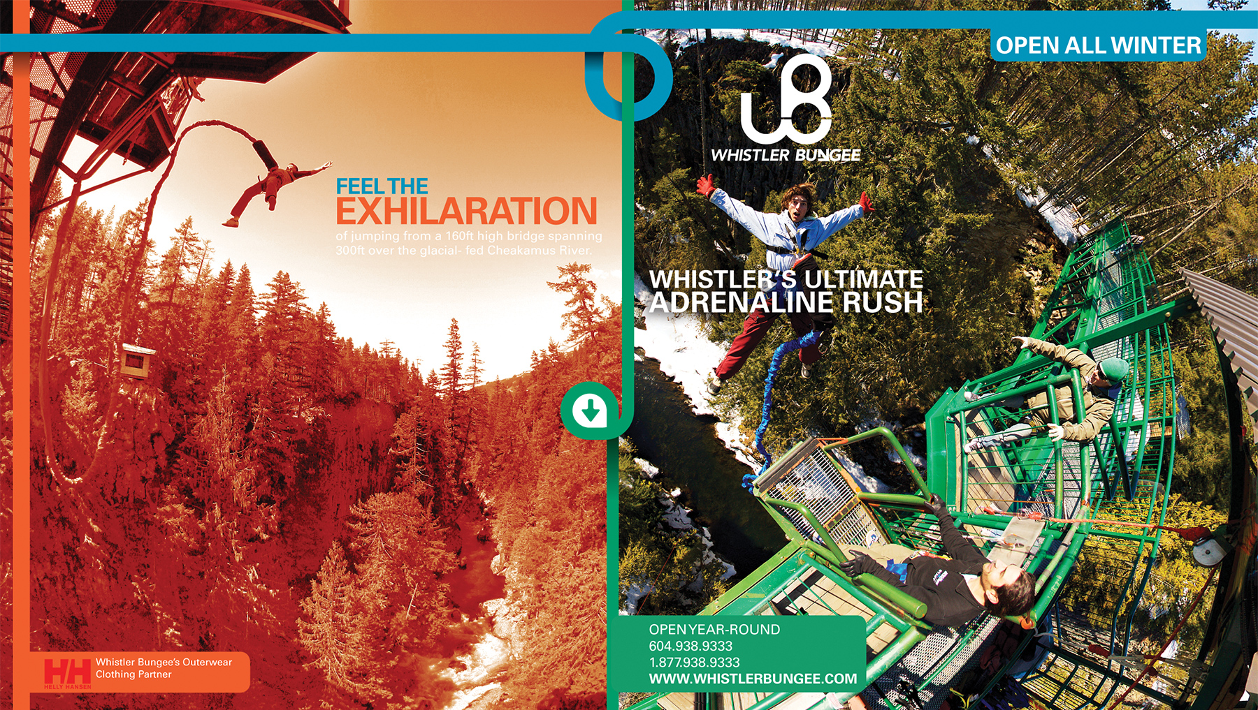
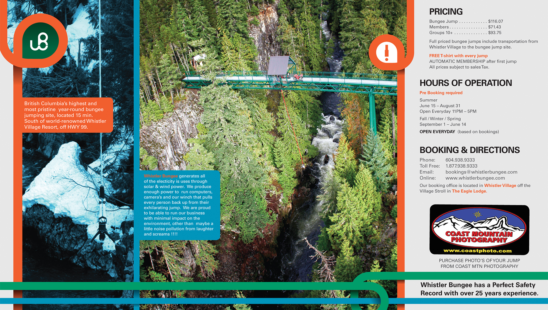
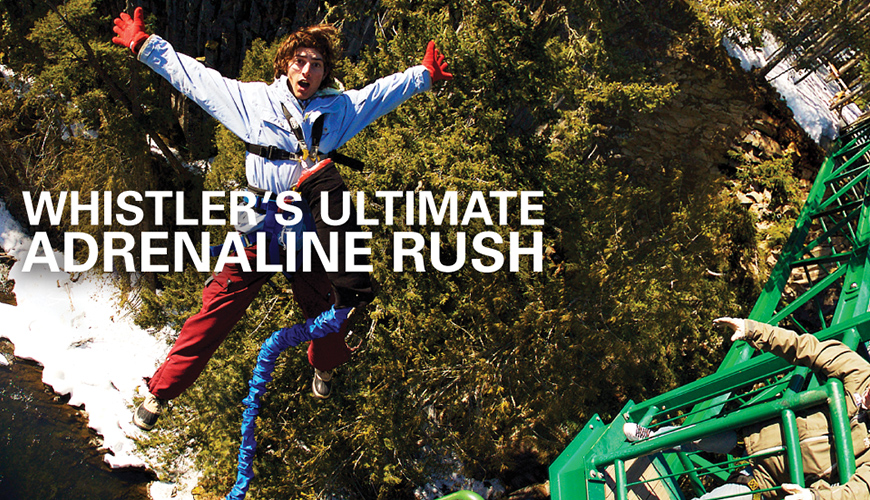
Whistler Bungee is a Bungee jumping company located 15min south of Whistler Village; the jump site is on a bridge spanning 300ft across a gorge surrounded by wilderness. The whole experience creates an adrenaline rush rarely equaled.
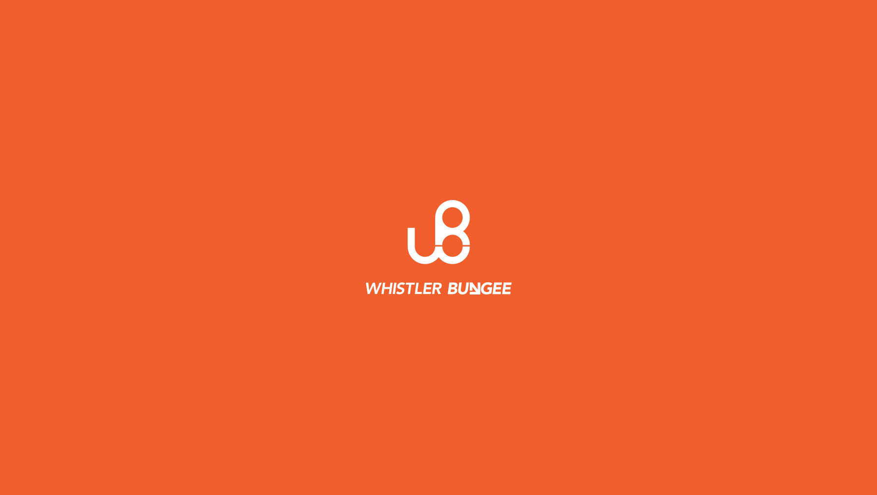
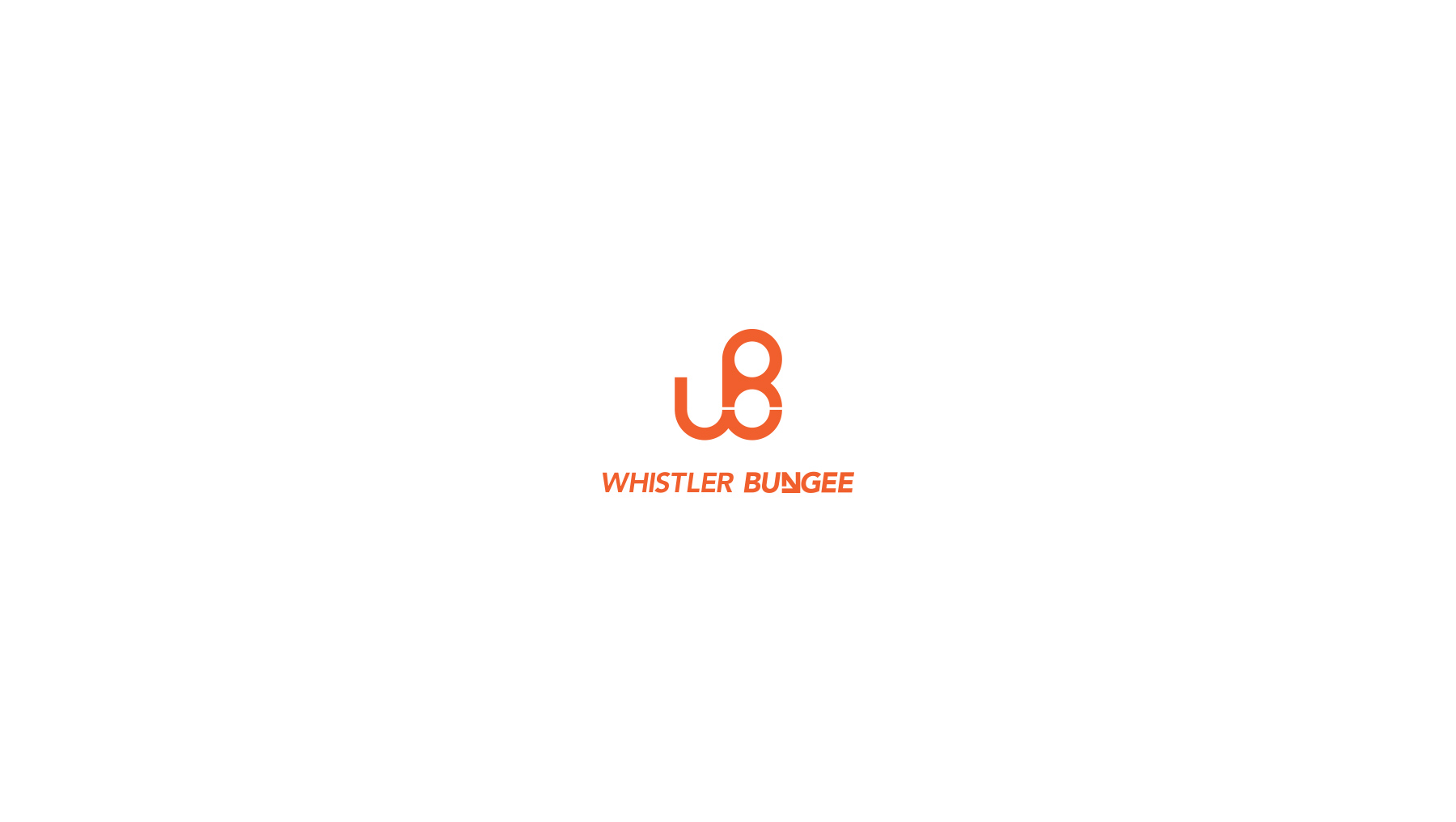
The new logo and word mark are more unique and simple then the previous design. The W & B representing Whistler Bungee, are combined together in a derivative figure 8 carabineer.
The word mark coupled with the logo is a thick italicized san serif italic. The italic shows the movement created from leaping off an extreme height with little more then a cord keeping you from certain death. To make the word mark completely unique the 'N' in bungee, was transformed into a basic arrow shape pointing down, to imply the idea of falling down. The new logo displays Whistler Bungee's ideology to anyone who would attempt the leap.
